When it comes to choosing paint, LRV is a game changer. It tells me how much light a color reflects, which can make my space feel brighter or cozier. Think of it as the secret sauce to achieving the perfect vibe in any room.
What is LRV?
LRV stands for Light Reflectance Value. It’s like the GPA of paint colors — you want a high score! Ranging from 0 to 100, colors with lower LRV values absorb light, making them feel darker.
On the flip side, colors with higher LRV values bounce light around like a ping pong ball at a lively party. A bright white can hit 100, while deep charcoal might be closer to 10.
If I pick a paint color with a low LRV for a small room, I might end up creating a cave instead of a cozy nook. So, next time I’m choosing a shade, I’ll keep LRV in mind to ensure my space feels just right!
The Role of Undertones
Understanding undertones is key when choosing warm neutral color schemes. It can make a big difference in how the colors interact and what vibe they create in a space.
Warm vs. Cool Undertones

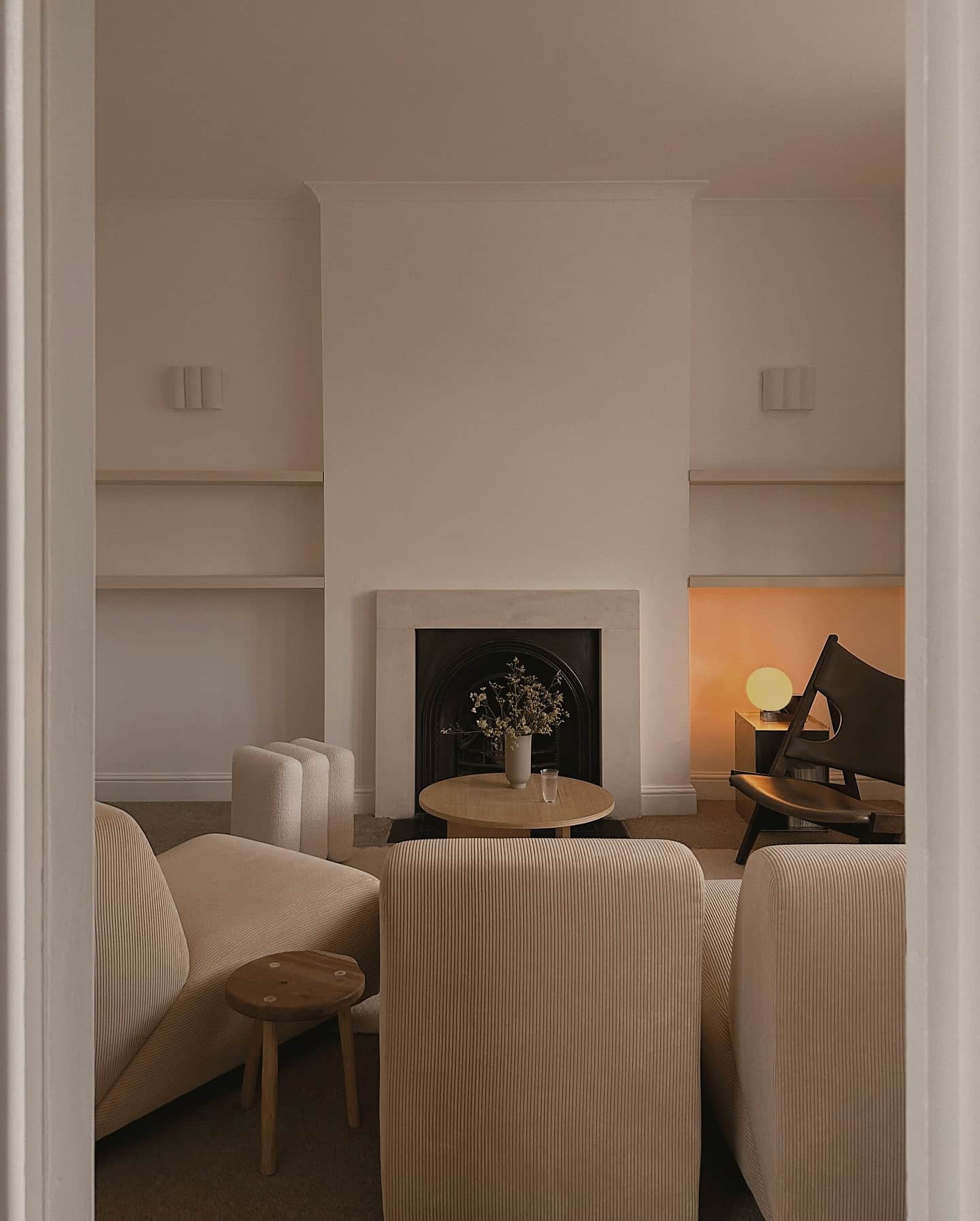
Let’s talk about the fun world of undertones! Imagine undertones as the sneaky sidekicks of color. Warm undertones often include shades like yellow and brown, making spaces feel cozy and inviting. For instance, light grey with warm undertones can pair beautifully with wood tones or warm colors like beige and soft pink.
On the flip side, cool undertones might give off hints of blue or green, creating a different mood. Cool colors can bring a bit of freshness to your neutral tone selections, especially when paired with charcoal gray. Knowing whether you’re dealing with warm or cool can make or break your room’s ambiance.
Pro Tip
Here’s a little nugget of wisdom for you: always sample your paint! Before committing, get test swatches and observe how they look throughout the day. Lighting changes everything. What seems like a warm taupe in the store could end up looking like a pink monster in natural light.
How Lighting Affects Color Perception
Lighting can transform a space. It can make a warm neutral color scheme feel like a cozy cocoon or a bland box. Each type of light brings its own flair, affecting how colors are perceived.
Natural Light
Ah, natural light! It’s like the universe’s way of saying, “Look how good you can look!” During the day, sunlight casts a warm glow that brings out rich tones in warm neutrals. The colors come alive, creating an inviting atmosphere.
Natural light changes throughout the day too. Early morning brings soft, golden rays, while midday sunlight can be harsher. As the sun sets, you’re back to that warm glow. Those moments? Perfect for turning any room into a cozy retreat.
Artificial Light
Now, let’s chat about artificial light. This is where things get a bit tricky. Unlike the sun, artificial light can vary widely based on the bulb type—like mood swings, but for light!
Warm white bulbs (think of a cozy café) make warm neutrals feel inviting and snug. In contrast, cool white bulbs can make them appear stark and unwelcoming. Imagine throwing on fluorescent lights at a romantic dinner—good luck!
Color Rendering Index (CRI) also plays a role. The higher the CRI, the more colors will seem true to life. So, if you want your space to feel like an inviting oasis rather than a hospital room, pick lights that mimic natural sunlight!
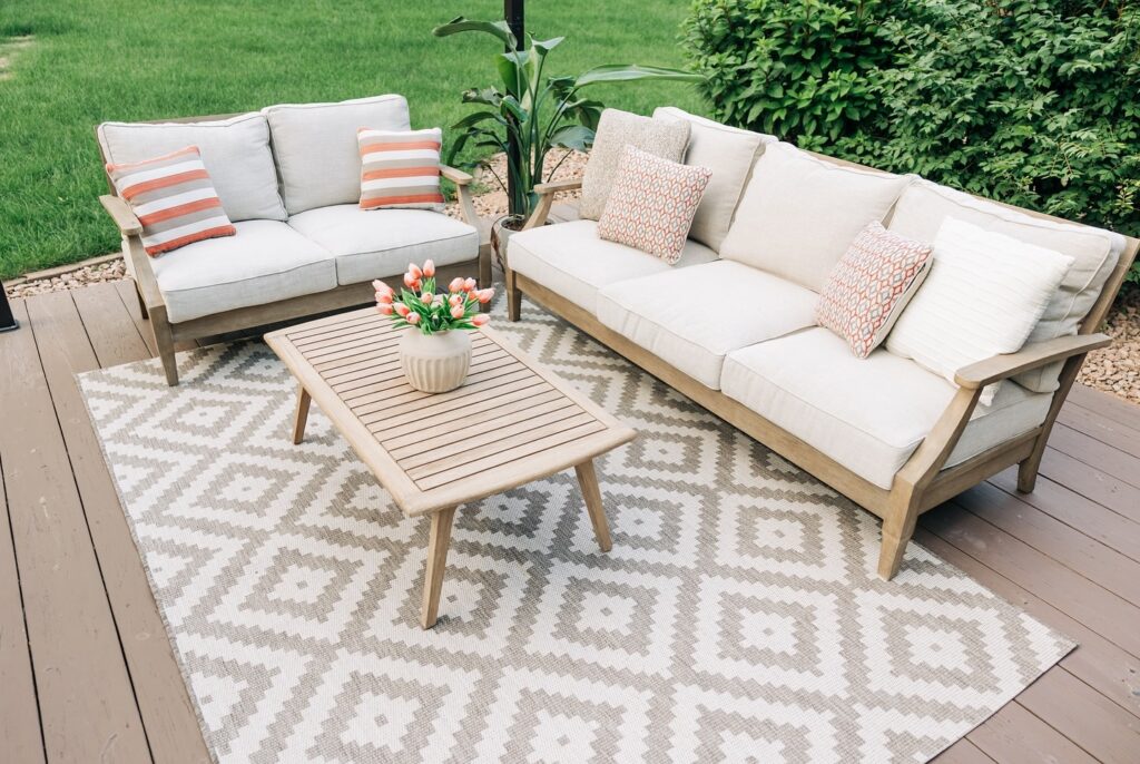
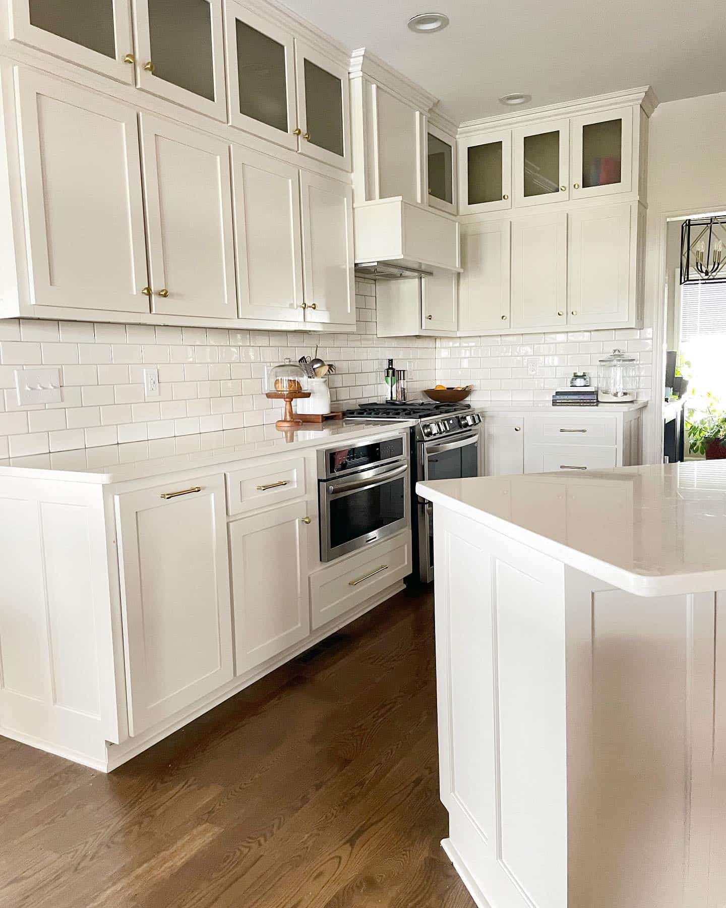
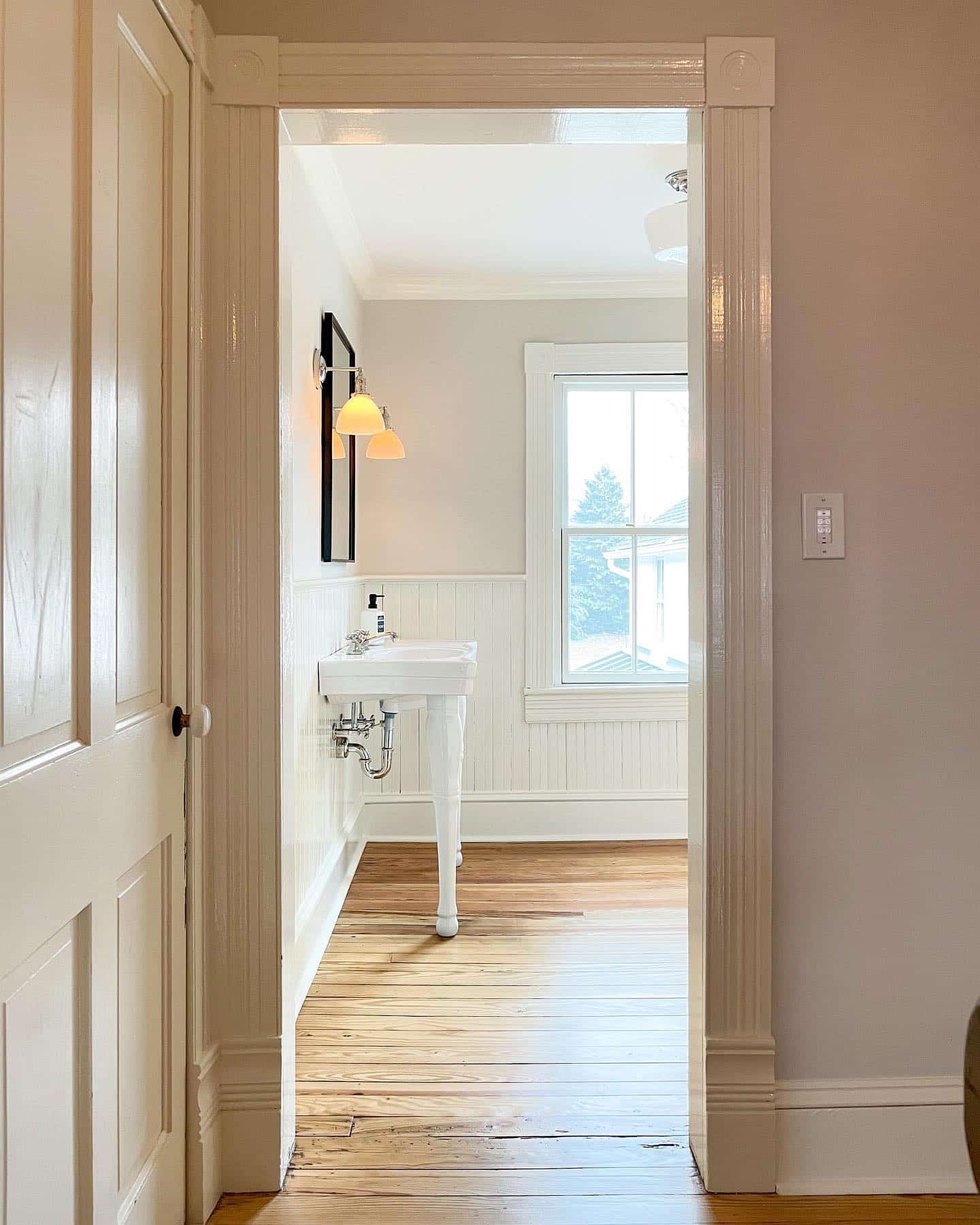
Top Warm Neutral Paint Colors
Finding the right warm neutral paint colors can feel like a treasure hunt. Luckily, there are some standout shades that can warm up any space without making it feel like a sun-drenched desert. Let’s uncover some of my favorites that blend comfort and style beautifully.
Sherwin Williams Heron Plume
Let’s start with Heron Plume. This delightful color captures the essence of a cozy evening at home. It’s a warm gray that flirts with beige, giving off a soothing atmosphere.
What’s great about Heron Plume is its versatility. It pairs beautifully with other warm colors like soft ivory, or even cool tones for a balanced look. It’s like that friend who gets along with everyone at the party!
Sherwin Williams Aesthetic White


Next up is Aesthetic White. Don’t let the name fool you; this isn’t just a pretty face! This warm white has subtle beige undertones that bring warmth without overpowering your space.
Its soft glow makes it perfect for open living areas or cozy nooks. I’ve found that it works wonders with natural light, making rooms feel spacious and inviting, like a warm hug from your favorite blanket.
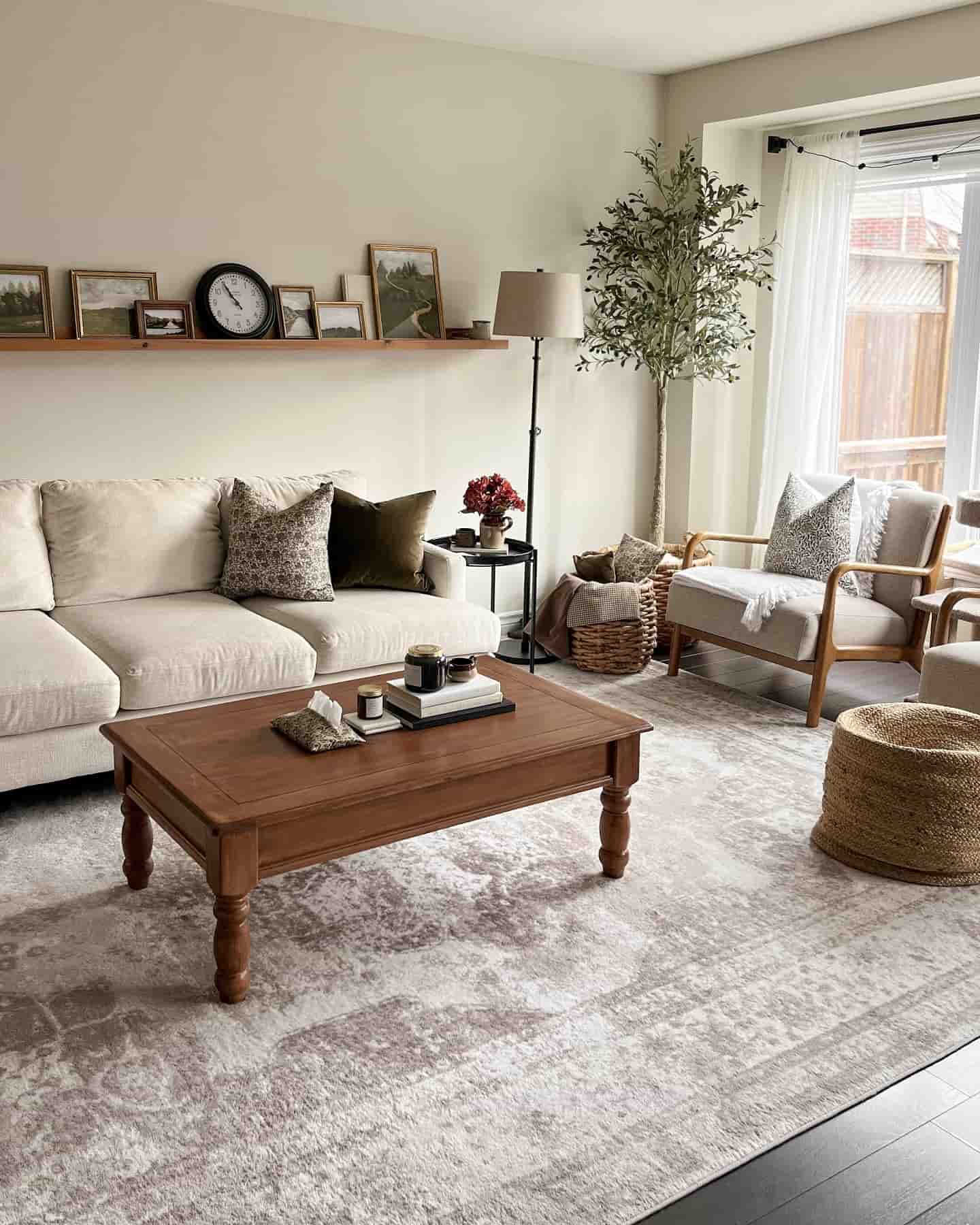
Benjamin Moore Pale Oak
Now, let’s chat about Pale Oak. This is one of those colors that feels like sipping a cup of coffee on a chilly morning. With its mix of soft taupe and warm beige, it glides into any room with ease.
Pale Oak looks particularly stunning in living rooms or bedrooms. It creates a calm atmosphere that invites relaxation. Pair it with warm cream accents for a cheerful and welcoming vibe.
Benjamin Moore Balboa Mist

Say hello to Balboa Mist. This lovely shade has a hint of gray with warm undertones that feels just right. It’s a great option for those who want something soft without diving into drastic color changes.
Balboa Mist acts as a perfect backdrop for brighter accents. Throw in some warm beige or even a hint of mushroom, and you’ve got a cozy atmosphere that makes guests feel right at home.
Sherwin Williams Modern Gray

Last, but certainly not least, is Modern Gray. This shade brings a contemporary twist to the warm neutral palette. It’s a light greige that blends beautifully with various colors, making it as flexible as a yoga instructor!
Modern Gray shines in modern spaces, but don’t count it out for traditional settings, either. It balances well with both sleek whites and warmer tones. This paint color can truly breathe life into a room while keeping it grounded.
Practical Tips for Choosing Paint
Choosing the right paint can feel like choosing a life partner. You want it to be perfect, but sometimes you just need to test the waters first. Here are some fun and practical tips to help you on your quest for the ideal warm neutral paint.
Test Samples

First things first: never skip the sample test. Grab some small paint samples and slap them on your wall. Don’t be shy!
Watch how they change under different lighting throughout the day. Morning sunlight and evening lamp light can turn your warm neutral into a chilly surprise. It’s like being in a bad relationship.
Pick a few shades that excite you and paint swatches as big as your enthusiasm. Paint samples can also help you see how your accent colors and brass accents, like those shiny picture frames, play together.
Compare Adjacent Colors

Now, let’s talk about adjacent colors. Once you’ve got your main contenders, it’s time to see how they stack up against each other.
Create a mini color party on your wall! Place swatches side by side to find which colors make you sing and which ones make you cringe.
Look for harmony with your textured fabrics. Those cozy throw pillows might sing “let’s get cozy” in one shade but scream “what were you thinking?” in another.
Consider Room Function
Finally, consider what each room does for you. Is it your peaceful sanctuary, or does it double as a war zone when you’re trying to find your keys?
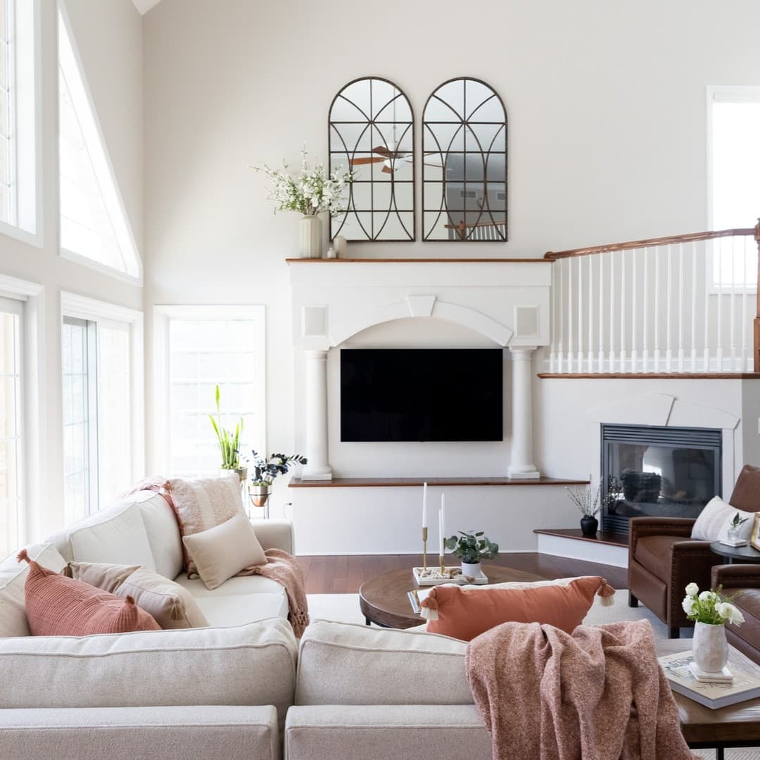
Warm neutral colors can transform a busy room into a calm haven. For a living room or bedroom, aim for a soothing hue that invites relaxation.
In a kitchen, maybe you want something brighter to inspire your culinary adventures, so your warm neutral can give way to a spirited accent color. Think of it as the supportive friend who knows when to shine!
Conclusion
Warm neutral color schemes can turn a dull space into something cozy and inviting. I’m here to help you engage your audience and leave a lasting impression. Get ready for some fun tips to make your designs pop!
Engagement
When using warm neutral colors, think about how they make viewers feel. These colors can evoke comfort and invite people in. Imagine lounging on a couch with a warm cup of cocoa—yeah, that’s the vibe!
Final Tip
Here’s a fun trick: combine your warm neutrals with a splash of contrast. Picture this: 80% warmth, 20% coolness, like sprinkling chilly mint over hot cocoa. This mix keeps your design cozy without being overwhelming.
Experiment with shades; think about using light taupes and deeper browns alongside accents of soft blue or mint. It’s a party for your eyes! Trust me, your audience will thank you for making their day a little brighter and cozier. So, go ahead, unleash your inner artist!