Well, well, well, it’s been long time already! It feels like just yesterday that we started this colorful journey together.
To celebrate, I thought we’d dive into the one topic that keeps us all on our toes—paint.
More specifically, the foolproof paint system that will help you avoid costly mistakes, regardless of your experience level.
If you’ve ever picked a paint color only to see it turn into something else entirely on your walls, you’re not alone.
Believe me, I’ve been there. The right paint job can be life-changing—transforming rooms from drab to fab. But get it wrong, and you’ll be stuck with an expensive mistake that may haunt you for years.
So, let’s break it down into the four key elements that’ll make your next paint job smooth, stylish, and, dare I say it, foolproof.
From understanding color consequences to choosing the right sheen, and even testing paint the proper way (yes, I’m talking about the “Rule of Three”), we’re going to cover it all.
Ready to paint your world the right way? Let’s go!
The Four Key Elements of a Foolproof Paint System

You’re about to get the paint secrets that will take your design game from zero to hero. Here’s what we’ll cover:
- Color and Consequences – Color is everything, but understanding the impact of your choices can make or break your space.
- Secrets to Sheens – You thought all paint was the same, didn’t you? Oh, my friend, you’ve got a lot to learn.
- The Marriage of Light and Color – The relationship between light and color is like that of a power couple: they need to be in sync for things to work.
- The Test Drive: Rule of Three – Don’t just trust your first impression; take your colors for a test drive (literally).
1. Color and Consequences: Know What Your Paint Needs to Do
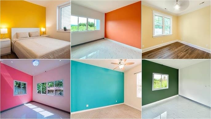
We’ve all been there: you find the perfect color swatch, get it home, and then—bam—what you thought was a soft lavender turns into an aggressive shade of pink once it hits the wall. Choosing the right color is about more than just picking something pretty off a paint chip—it’s about understanding how color interacts with light, space, and even your furniture.
Here’s where understanding Light Reflectance Value (LRV) comes in.
What is LRV (Light Reflectance Value)?
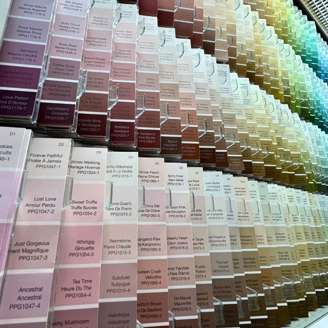
You know how some colors look one way in the store and a whole other way when they hit your walls? Well, that’s due to the LRV, a scale from 0 to 100 that measures how much light a color reflects. The higher the LRV, the more light it bounces around, making your room feel brighter and more spacious.
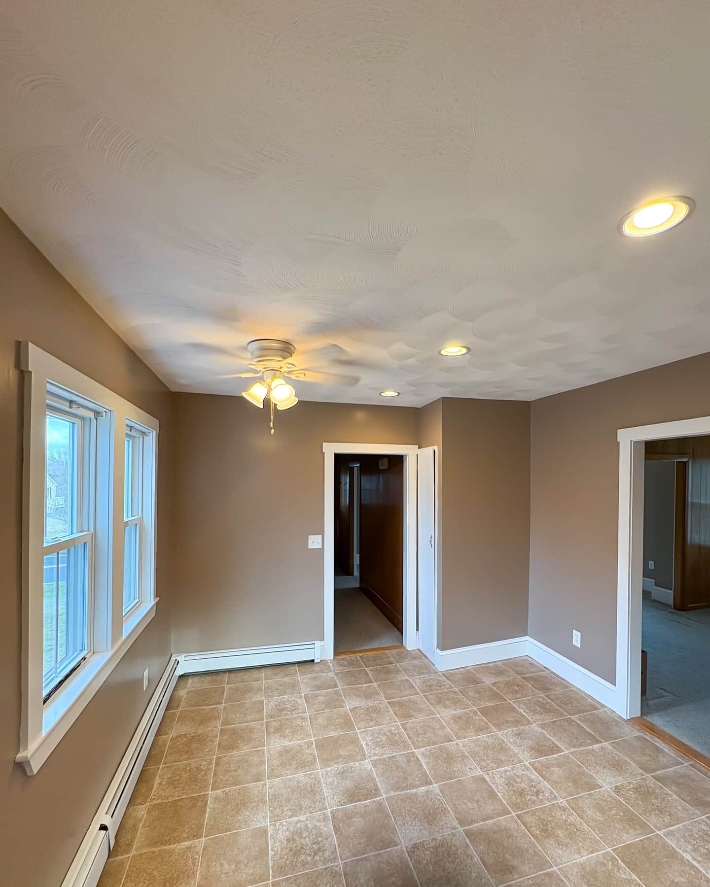
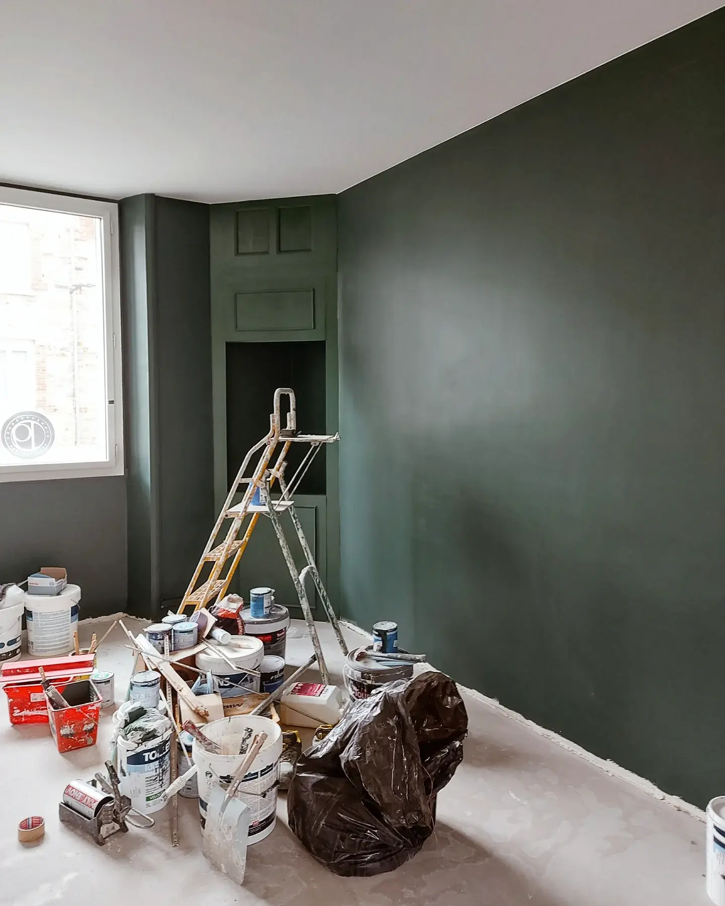
- Low LRV colors (think: deep navy, charcoal, rich chocolate) absorb light and make a room feel smaller and cozier.
- High LRV colors (light whites, soft pastels, pale grays) reflect light and give the illusion of space, making them perfect for smaller rooms.
How LRV Affects Space?

- Small spaces can benefit from high LRV colors. They make the room feel larger and airier. So, if you’re working with a bathroom or cozy bedroom, you’ll want to go for those light tones.
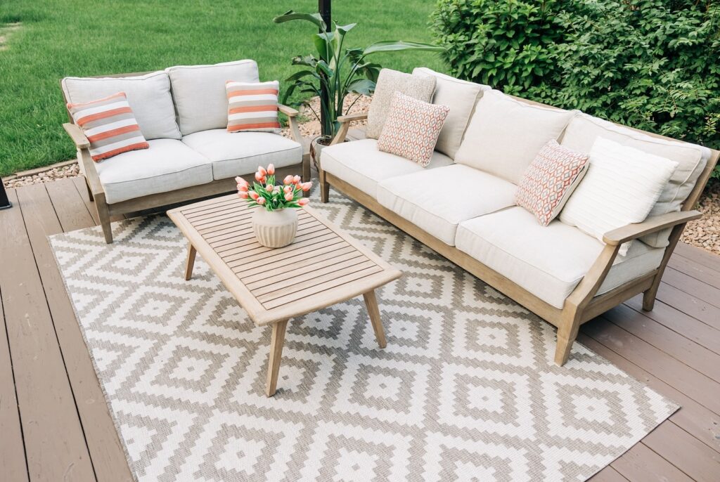
- Larger rooms can take more risks with darker tones because they won’t feel too boxed in. But here’s the secret: uniformity is key. If you go dark on the walls, don’t make your trim stark white. Instead, use a slightly lighter shade of the same color for a seamless look.
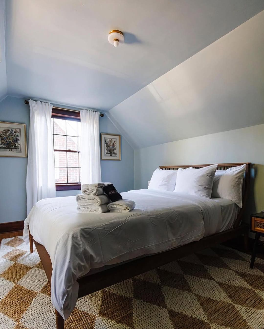
How to Handle Angled Ceilings and Open Floor Plans?
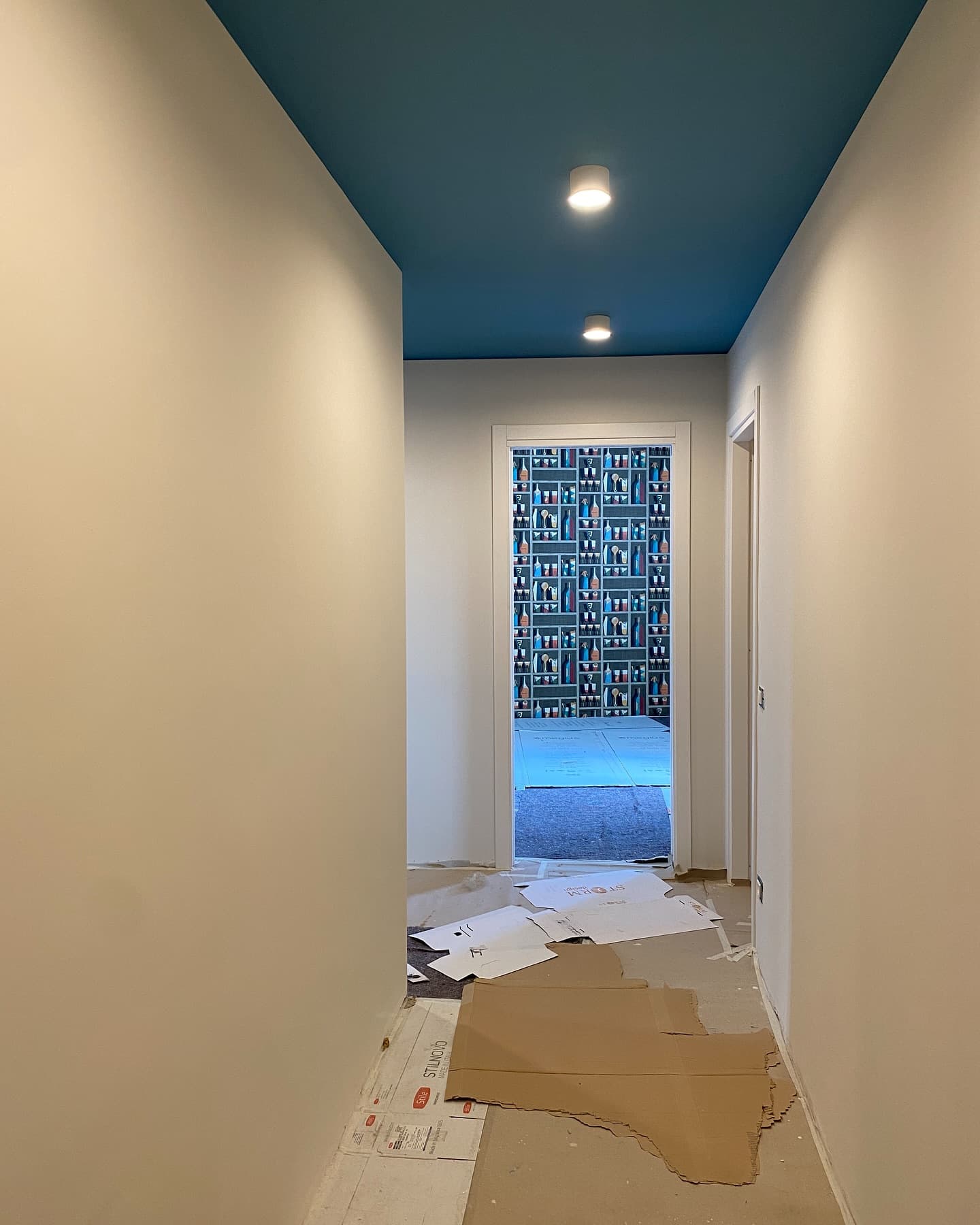
- If you’ve got a room with angled ceilings, choosing the right wall and ceiling color combo can make or break the vibe. For example, if you paint your walls one color and the ceiling a stark white, the ceiling might feel too “cut off” from the walls, making the space feel smaller. A unified, lighter ceiling and wall color will give you that smooth, expansive look.
- In open floor plans, you want colors that flow seamlessly. A contrast in wall and ceiling colors may work in some spaces, but it can make the flow feel choppy in others.
Dealing with Applied Moldings (Crown, Chair Rail, Wainscoting)

- Trim and moldings often become an afterthought, but they can be your best friend when choosing paint. For a polished, cohesive look, keep the tonal values consistent. Using the same color for your crown molding and walls—just a few shades lighter or darker—creates an elegant, unified feel.
2. Secrets to Sheens: Shine Bright Like a Diamond (But Not Too Much)
You didn’t think all paint finishes were created equal, did you? There’s a whole range of sheens, and choosing the right one for the right space is essential. Here’s a breakdown of the five main types and where to use each:
The Five Types of Sheens
- Matte/Flat: This is your go-to for low-traffic areas like bedrooms and ceilings. It’s smooth and sophisticated but tends to show dirt or smudges, so not ideal for high-use spaces.
- Eggshell/Pearl: Eggshell offers a soft sheen with a little more durability. It’s perfect for spaces like bathrooms and kitchens where you need something a bit more wipeable without the high shine.
- Satin: Ideal for trim, cabinets, and doors, satin gives you a slight sheen that’s elegant but not overpowering. It’s also pretty easy to clean, making it perfect for high-traffic areas.
- Semi-Gloss: Semi-gloss is your friend when it comes to moldings, cabinetry, and kitchen backsplashes. It has that shiny look without being over-the-top. Plus, it’s great for high-humidity spaces like bathrooms.
- High-Gloss: This is reserved for special areas like front doors or millwork. The ultra-shiny finish can look stunning on detailed woodwork but requires a steady hand and a high-quality base coat to avoid visible imperfections.
Where to Use Each Sheen?

- Matte is ideal for spaces that don’t see a lot of wear and tear (think: bedrooms or home offices).
- Eggshell/Pearl is your best bet for kitchens and bathrooms where you’ll need to scrub every now and then.
- Satin is your hero for trim, doors, and cabinets. It’s easy to clean and won’t make your room feel like a wax museum.
- Semi-Gloss gives your applied moldings and cabinets that subtle, easy-to-maintain shine.
- High-Gloss is not for the faint of heart. Use it sparingly, but when you do, it’ll add a bold, eye-catching effect.
3. The Marriage of Light and Color: The Ultimate Power Couple
You thought color was everything, right? Well, as it turns out, lighting is just as important, if not more so. How your paint looks in your home depends on the light temperature, which can completely change the way your chosen shade feels in a room.
Differences in Light Temperature
- Warm light (3,200K): This soft, cozy glow brings out the warmth in your paint colors, making them feel inviting and relaxing. Think of it as a glass of warm wine—perfect for a dining room or bedroom.
- Cool light (5,000K): This bright, crisp light is ideal for showcasing the cool tones in your paints. If you’ve chosen a modern, contemporary color, this kind of light will make it pop.
Why Lighting is Crucial When Choosing Paint?
You know how paint always looks one way in the store and another way on your walls? That’s because paint only shows its true color in the right lighting. So, always test your paint in your home’s lighting before committing.
4. The Test Drive: Rule of Three
Let’s get real for a second: color is deceptive. That little swatch in the store can look totally different once you slap it on your wall. That’s where the Rule of Three comes in—because no one should make a paint decision based on an impulse buy, right?
What is the Rule of Three?
Paint three test swatches in three different spots and observe them for three days. Here’s why this works:
- Test in three places: One at eye level, one near the floor, and one near the ceiling. Colors often look different depending on the surface and how the light hits them.
- Use different lighting: Test during morning, midday, and evening. Natural light can vary throughout the day, so you want to see how the color adapts.
- Label your swatches: Keep track of what’s what so you don’t get confused (I’ve definitely done that before—learn from my mistakes!).
How to Analyze Your Test Results?
After three days, evaluate how each color looks under different lighting conditions. Does one feel too dark? Does another make the room look smaller than you anticipated? Based on your observations, make your final decision. This gives you a much clearer idea of how your paint will perform long-term.
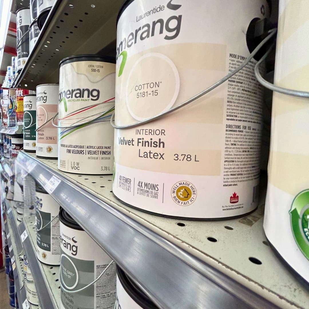
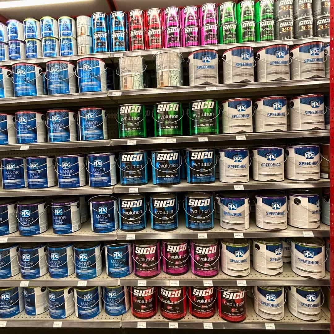
5. Where to Buy the Best Paint
We’ve covered a lot about the ins and outs of paint, but let’s talk about where to buy it. Sure, you could hit the big box stores, but here’s my personal favorite:
Benjamin Moore
- Benjamin Moore has a stellar reputation for high
- quality, long-lasting pigments that hold up over time. The coverage is fantastic, and their range of colors is extensive. Plus, their formulas are designed for durability—perfect for high-traffic spaces or those that see a lot of wear.
Other Recommended Brands
- U.S. & Canada: Farrow & Ball, Sherwin Williams, Behr, Valspar, PPG, and Cloverdale all offer top-notch products.
- U.K. & Europe: Mylands, Little Greene, and Brillux are great options across the pond.
- Australia & New Zealand: Sydney Harbor Paint Company, BIO paints, and Aalto Colour are fantastic choices for that side of the world.
Why Pay More for Quality Paint?
Quality paint doesn’t just look better—it lasts longer, covers better, and is less prone to fading or cracking. It’s an investment that will save you money (and headaches) down the road.
Conclusion
In this colorful journey through the art of paint, we’ve covered the four key elements that’ll make your next project foolproof. From understanding the consequences of color and the importance of sheens to the crucial test drive, these tips will set you up for success.
Don’t be afraid to share your favorite paint brands and tips in the comments.