Solution: Decorate First, Color Later
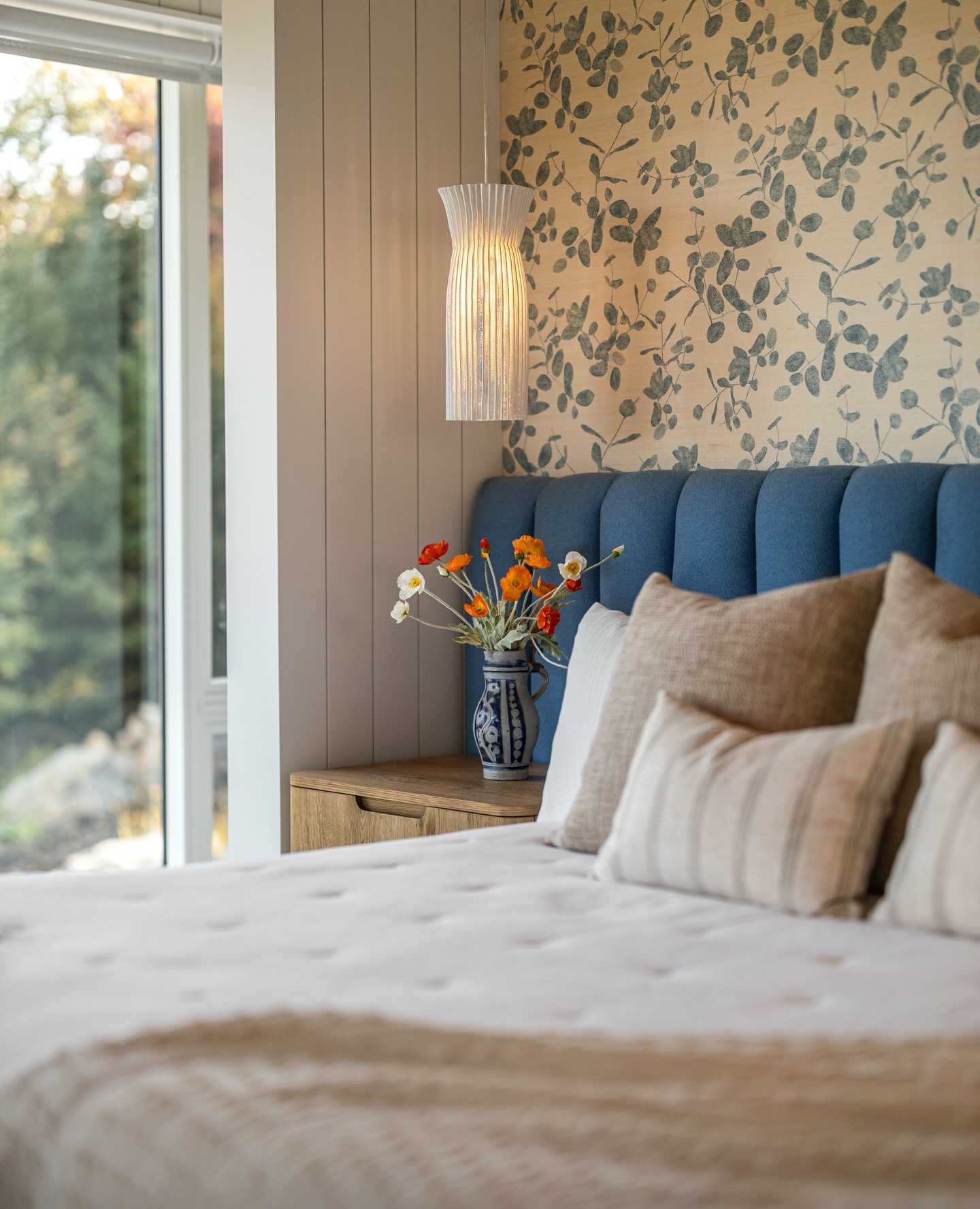
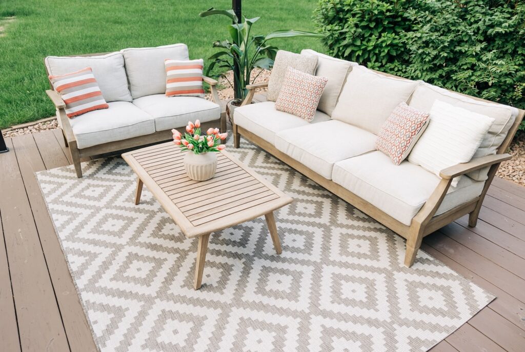
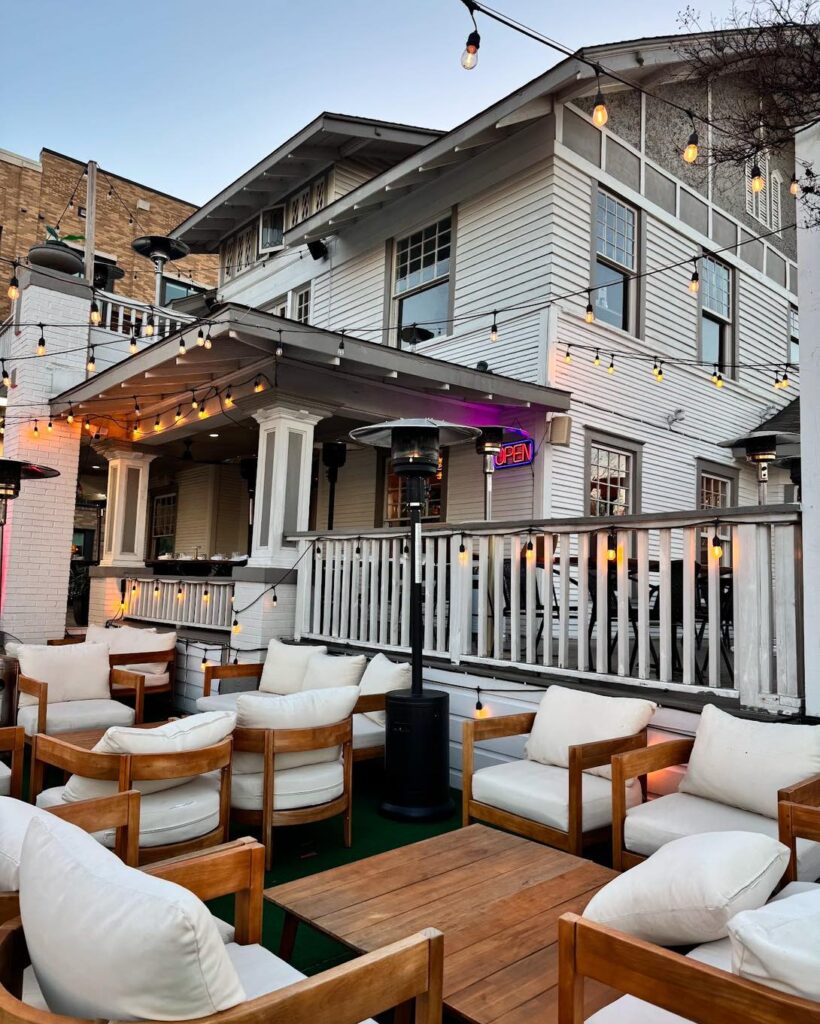
Here’s a bright idea: I learned that it’s best to select your furniture, artwork, and décor before you even think about paint colors. Gather all your items and play around with them in the space.
This way, you can pick a color that complements everything else. Whether it’s the pillow patterns or the rug, your final choice will harmonize with the room.
Make a color swatch—maybe even a mood board—and take your time to find the perfect match.
Then, once you have your palette, you can joyfully point and say, “I want this one!” without fear of regret.
Why This Method Works
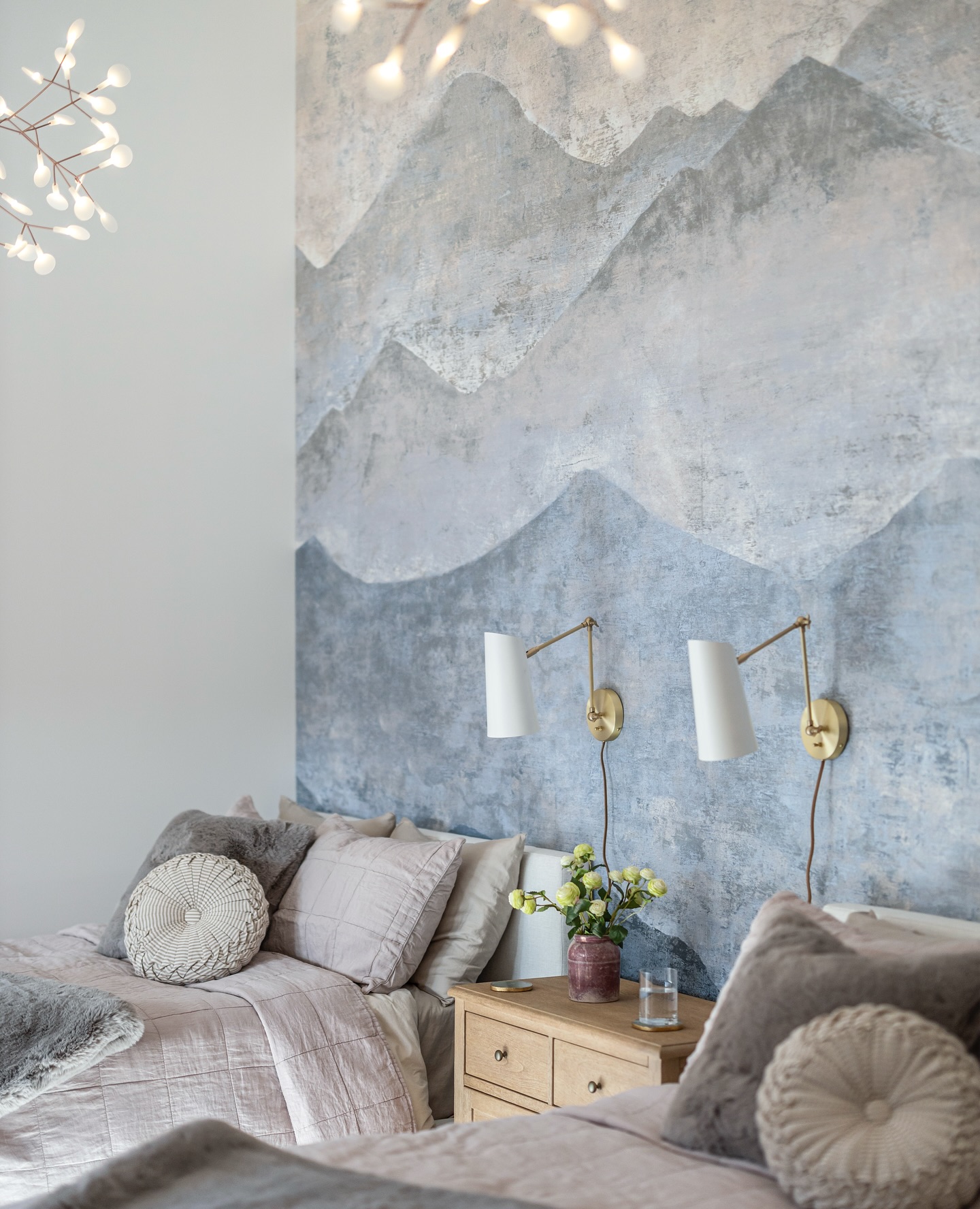
Why is this method a winner? For starters, it allows you to see how lighting interacts with various colors during different times of the day.
The right choice can enhance your space and mood while keeping everything cohesive. Choosing after you’ve decorated ensures you won’t end up with a paint color that makes your carefully chosen decor look like it just survived a paintball fight.
2. Not Paying Attention to Your Space’s Existing Elements
Solution: Mind the Undertones
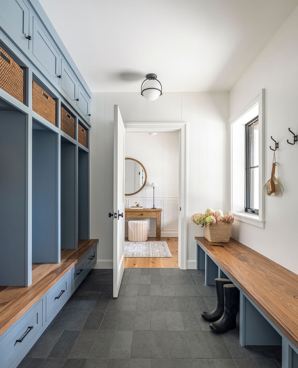
Speaking of undertones, they are crucial in color selection. Every paint color has an undertone lurking beneath the surface, and it will make or break your color scheme.
When choosing paint colors, hold up swatches against existing elements like your window trim or furniture. Do they play nice or do they seem like they’re from rival clans?
3. Relying Too Much on Online Photos or Small Paint Chips
Example of Photographic Deception
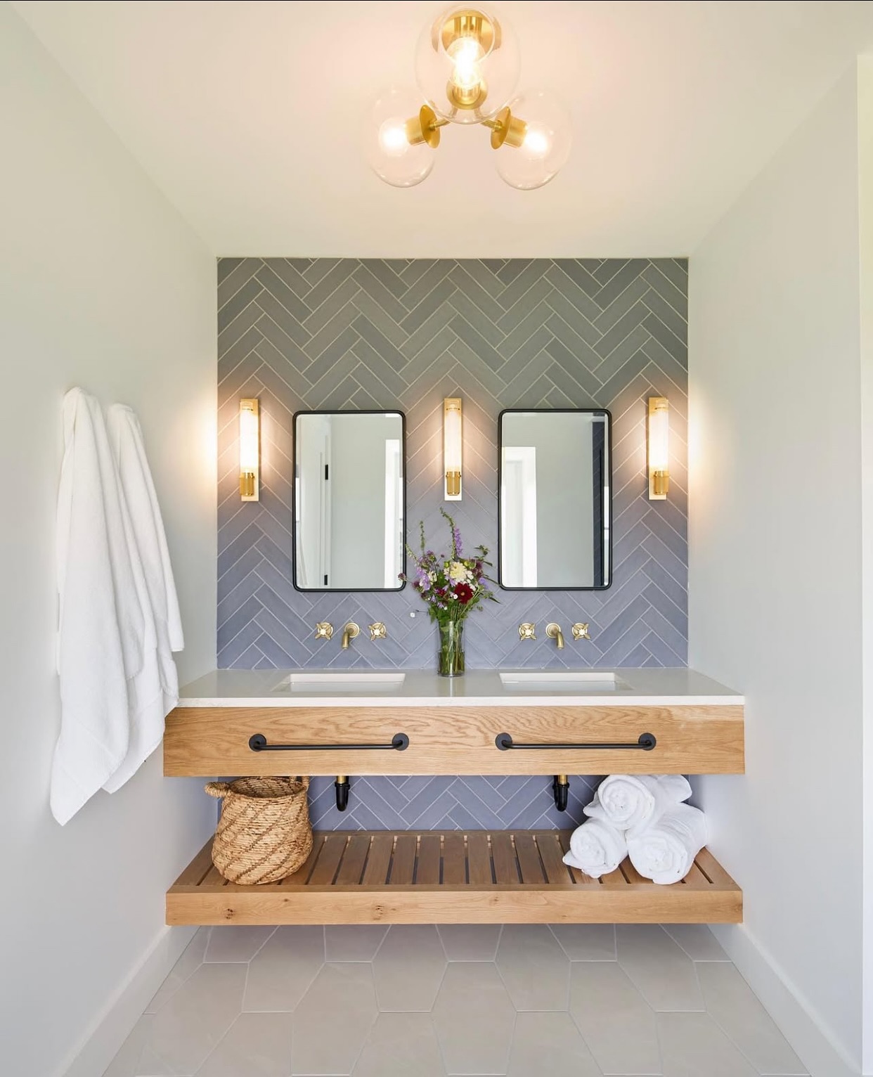
I remember browsing through endless home décor sites, admiring a deep teal wall that gave off a cozy vibe.
I could almost hear the relaxing ocean waves. Yet, when I painted my hallway with that same shade, I felt like I was trapped in a cave.
Photos can deceive you into thinking a color will be perfect, but it might be the worst color to paint a room.
My once hopeful hallway transformed into what looked like a scene from a spooky horror movie. Lesson learned: Don’t let a photoshopped wonderland lure you into bad decisions.
Solution: Inspiration vs. Reality
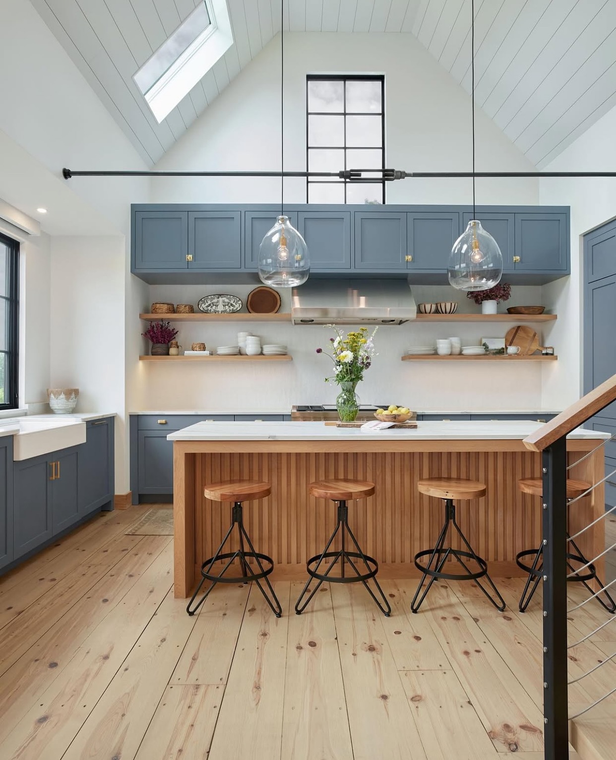
Instead of assuming that photos give an accurate view, I now treat them as mere inspiration. I browse for ideas, but the real test happens in my home.
You may love how that lavender looks in a bright room, yet in your dim space, it could feel gloomy.
I recommend printing out some color samples or using paint apps to visualize how each shade will look.
Better yet, I take my favorite colors and test them on a small area of my wall. This way, I get to see the color in different lights before I commit to a full gallon. Trust me, this small step saves a lot of tears.
4. Not Testing Paint Colors in Your Space
Testing paint colors is crucial. You might think you love that bold red, but in my living room, it could feel more like a horror movie set.
A sunny afternoon can make a color pop, while dim evening light might lead to regret. I’ve learned to embrace that testing phase as a fun part of the painting process.
Example of Natural Light Gone Wrong
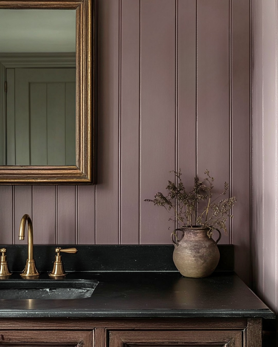
I once painted my bedroom a lovely shade of blue. It looked amazing in the store, under bright lights.
When I got it home, the natural light transformed it into a weird shade of teal. I felt like I was living in a fish tank! That’s what happens when natural light plays tricks on us.
Solution: Test Before You Commit
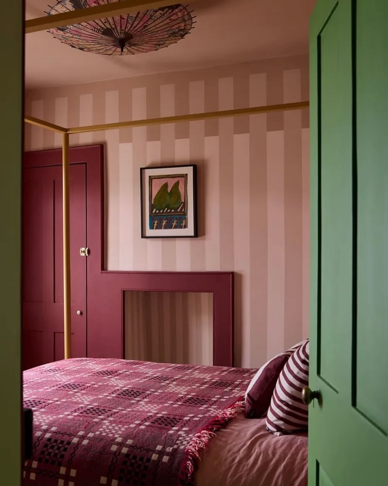
The simple solution? Test first! I now get samples from the store and put them on my walls before making any final decisions. This is essential. Start by painting a small patch, maybe 2×2 feet. This allows you to see how the color looks with your furniture and décor. It’s like dressing up for a big event—you want to make sure it feels right!
How to Run Your Paint Test
To run a proper paint test, I follow a simple process:
- Gather Samples: Get at least three colors you like.
- Prep the Walls: Clean the area and apply a primer if needed.
- Paint Small Sections: Use a brush to apply each color in separate squares.
- Observe at Different Times: Look at your samples in the morning, afternoon, and evening to see how they change.
- Live with It: Leave the samples up for a few days. This gives me a better idea of how I truly feel about the colors.
This method has saved me from many “what was I thinking?” moments! Trust me, testing is the way to go.
5. Expecting Paint to ‘Save the Day’
I can’t count how many times I’ve thought paint could solve all my decorating problems. News flash: it won’t.
Paint is not a magic wand that turns a blah room into a Pinterest paradise. Instead, it’s more like a trusty sidekick; great when used correctly, but it can’t save the day alone.
First off, I need to bust the myth that paint can transform a room all by itself.
Sure, a fresh coat can brighten things up, but it can’t fix a poorly arranged space or mix-matched furniture.
Example of Color-Decor Disconnectedness
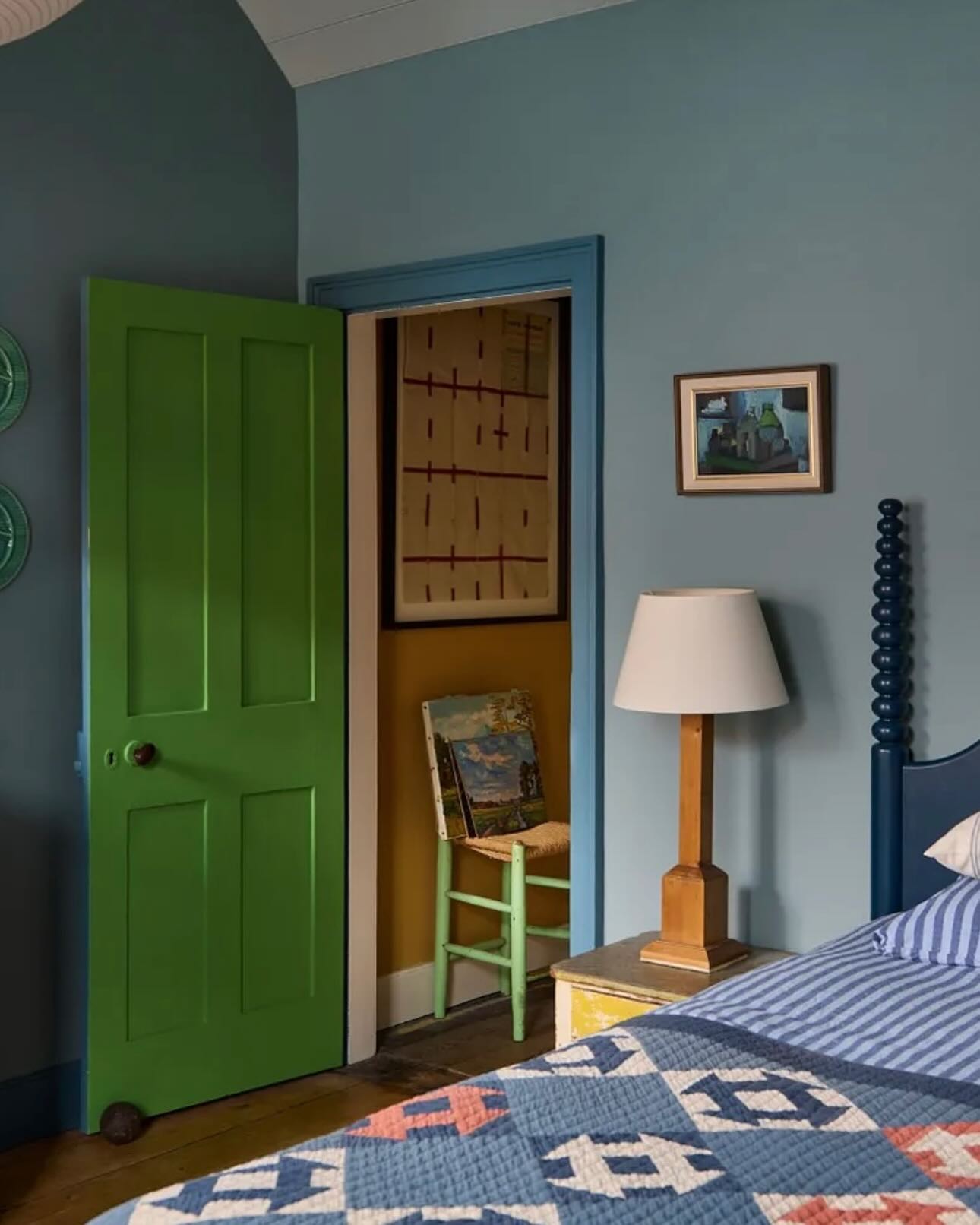
Here’s a fun example: imagine a room with a bright orange wall that screams “look at me!” but the decor is a beige snooze fest.
The colors clash harder than a band at their first gig. The vibrant orange needs balancing; otherwise, it stands out like a sore thumb.
Solution: Make Paint Your Sidekick
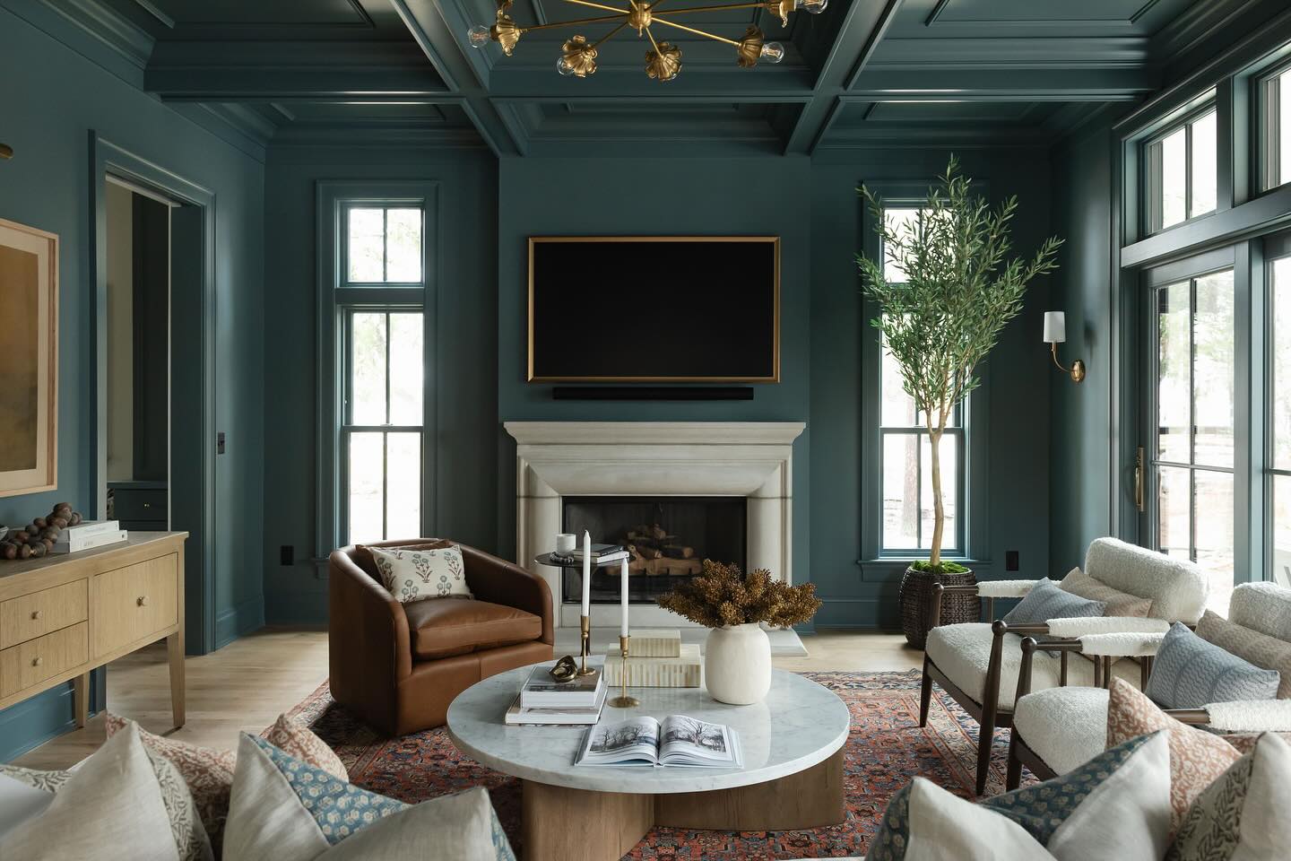
Instead of relying on paint to rescue your room, think of it as a support player. Start by arranging your furniture and decor first.
Choose a cohesive color palette that brings the space together. Once you have that, use paint to complement your choices.
Need a pop of color? Maybe a cheerful yellow accent wall would work perfectly with your navy furniture. It’s teamwork at its finest.
Conclusion
Choosing paint colors can feel like navigating a labyrinth. I’ve learned a few things to avoid ending up with a color that makes me feel like I’m living in a cartoon.
So, before you grab that roller, take a moment. A
void these common traps, and you’ll avoid the paint-induced regret that lurking in my past!