Selecting paint colors for your living room can feel like choosing a life partner. It’s all about compatibility.
You want colors that work well with the lighting and existing elements in your space. Plus, let’s bust a few myths along the way. Buckle up!
Understanding Light Reflectance Value (LRV)

Ever heard of LRV? No? Well, it sounds fancy, but it’s pretty simple. Light Reflectance Value shows how much light a color reflects. The scale goes from 0 to 100. Zero means “as dark as a black hole,” while 100 is as reflective as a shiny disco ball.
Evaluating Fixed Elements In Your Space

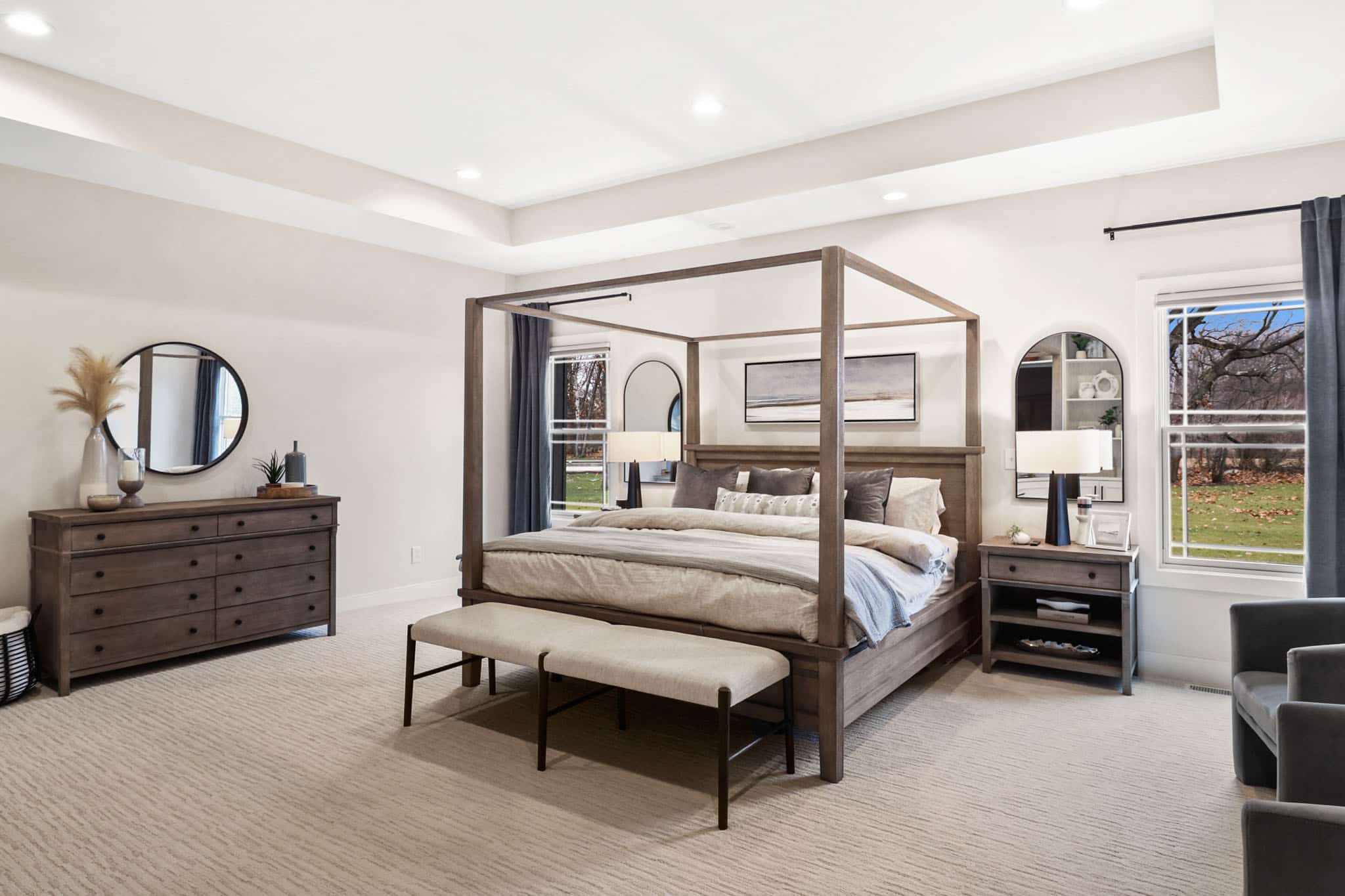
Now, let’s chat about the heavyweights in your room: fixed elements like sofas, cabinets, and flooring.
Look at the colors of your furniture and flooring. If your couch is a deep blue, you might want to choose a wall color that brings out those shades without competing.
Debunking The Myth Of Outdated Colors

Some folks hold on to the idea that certain colors are out of style. Honestly, that’s just a myth. Remember the avocado kitchens of the ’70s? What a time.
If you love a color that’s supposedly “outdated,” go for it! Styles come and go like fashion trends. If seafoam green makes your heart sing, throw it on those walls!
Your living room is your canvas. Embrace your quirks with colors that speak to you, even if they’re not this year’s trendsetter.
Expert-Recommended Living Room Paint Colors
Benjamin Moore Swiss Coffee

Let’s start with Swiss Coffee. This isn’t your average coffee; it’s a pale gray with a sneaky green undertone.
Trust me, it whispers “classy” while making your stone fireplace look like a million bucks.
With a light reflective value (LRV) of 81, it brightens spaces without turning into a glaring eyesore.
Benjamin Moore White Down

Next up, we’ve got White Down. This delightful cream color has an LRV of 71, adding warmth without the sterility of brighter whites.
If you prefer your space to resemble a cozy café rather than an operating room, this is your go-to.
Sherwin Williams Creamy
Sherwin Williams Creamy is like a breath of fresh air in a can. With a bright LRV of 81, it fills your space with light while keeping things warm and cozy.
Imagine stepping into a room that radiates the cheerful glow of a sunny day, but without the sunburn.
Sherwin Williams City Loft

City Loft brings a fabulous gray option to the table. With an LRV of 71, this color has green undertones that help it blend seamlessly into sunlit spaces.
It’s versatile enough for any decor, from modern to rustic.
Sherwin Williams Accolade

Accolade is the slightly darker sibling of City Loft, boasting an LRV of 65. It’s perfect for rooms that see loads of natural light.
The color adds depth without feeling heavy, keeping your space feeling light and airy.
Benjamin Moore Nimbus

Let me introduce you to Benjamin Moore Nimbus, a charming gray with a whisper of blue. It’s like the cool friend at a party who makes everyone feel relaxed without stealing the spotlight.
With a Light Reflectance Value (LRV) of 59, it’s bright but not blinding.
Benjamin Moore Edgecomb Gray

Last on our list is Benjamin Moore Edgecomb Gray. It’s like having your cake and eating it too because it strikes the perfect balance between warm and cool.
With its soft, inviting approach, this shade is fantastic for any living room.
Beiges And Taupes: Perfect For Creating Warmth
Beiges and taupes can brighten spaces and create a cozy atmosphere. They work with various decor elements, adding charm without overpowering the room.
Sherwin Williams Neutral Ground

Imagine a soft beige with a hint of green. That’s Sherwin Williams Neutral Ground. It has an LRV of 70, which means it’s not too light, but it’s definitely not a deep shade either. This color is like that reliable friend who’s always there to warm up your living room.
Benjamin Moore Navajo White

Now, let’s talk about Benjamin Moore’s Navajo White. This lovely beige brings a splash of orange undertone to the table, making it great for spaces with natural stone or warm wood touches.
Sherwin Williams White Sesame
Next up is Sherwin Williams White Sesame. This taupe with a subtle pink undertone has an LRV of 71, bringing a cozy vibe to any space. It won’t fight with your existing decor, especially if you have taupe undertones already there.
Benjamin Moore Pale Oak

Lastly, let’s check out Benjamin Moore Pale Oak. This taupe has a slight hint of purple undertone, which adds a little pizzazz to the neutral palette. At an LRV of 68, it’s subtle but still has personality!
Yellow And Blue Tones: Subtle Yet Beautiful
Yellow and blue are a match made in design heaven. When combined, they create a cozy and inviting space.
Let’s explore some standout choices that will help you bring a touch of charm into your living room.
Benjamin Moore Mushroom Cap

I can’t help but smile when I see Benjamin Moore Mushroom Cap. This color is like a warm hug in paint form—soft beige-yellow with just the right hint of warmth.
It’s perfect for those who want a gentle touch of yellow without shouting, “Look at me!”
Sherwin Williams Lullaby

Now, let’s talk about Sherwin Williams Lullaby. This soft blue comes with a gray undertone that whispers sophistication instead of shouting nursery.
It feels calm and collected—just what you need after a long day.
Benjamin Moore Harbor Haze

Ah, Benjamin Moore Harbor Haze. This one’s for those who like their blues a bit more adventurous—slightly darker but equally sophisticated.
It has a gray undertone that brings balance to its richness.
Green-Hued Neutrals: A Fresh Touch
Looking to spritz up your living room? Green-hued neutrals might just be your new best friend.
They add freshness without overwhelming your space, creating a peaceful vibe that whispers, “Hello, nature!”
Benjamin Moore Hancock Green

Let’s talk about Benjamin Moore Hancock Green. This color has a soft green with a hint of gray—kind of like a friendly forest friend who’s not too pushy. It scores a 66 on the Light Reflectance Value (LRV) scale, which is fancy talk for “it won’t make your room feel like a cave.”
Final Thoughts
So, are you ready to unleash your inner artist? Grab those paint samples and start transforming your living room into a masterpiece. Who knew color could be so much fun?
Remember, the hues you choose set the mood for your home. So, channel your inner Picasso, avoid that disco ball yellow, and transform your living space into a stylish sanctuary.
If you’re feeling a bit lost in the sea of hues, no panic. Just give me a shout! I’m here to help you find the perfect shade for your unique space.
Thanks for sticking around! I hope these ideas spark some creativity in your home. Keep an eye out for more bright and colorful tips coming your way.
Let’s paint the town… or just your living room!